The Bear Review
Kansas City, KS
[Publication Brand Identity Pitch]
Opportunity
The Bear Review is a semi-annual art and literature publication currently operating out of Kansas City.
The review as a business was in dire need for a cohesive visual system to give their marketing channels consistency and clarity.
The Bear Review name is inspired by the founders experience with bears as a child and their mystical nature.
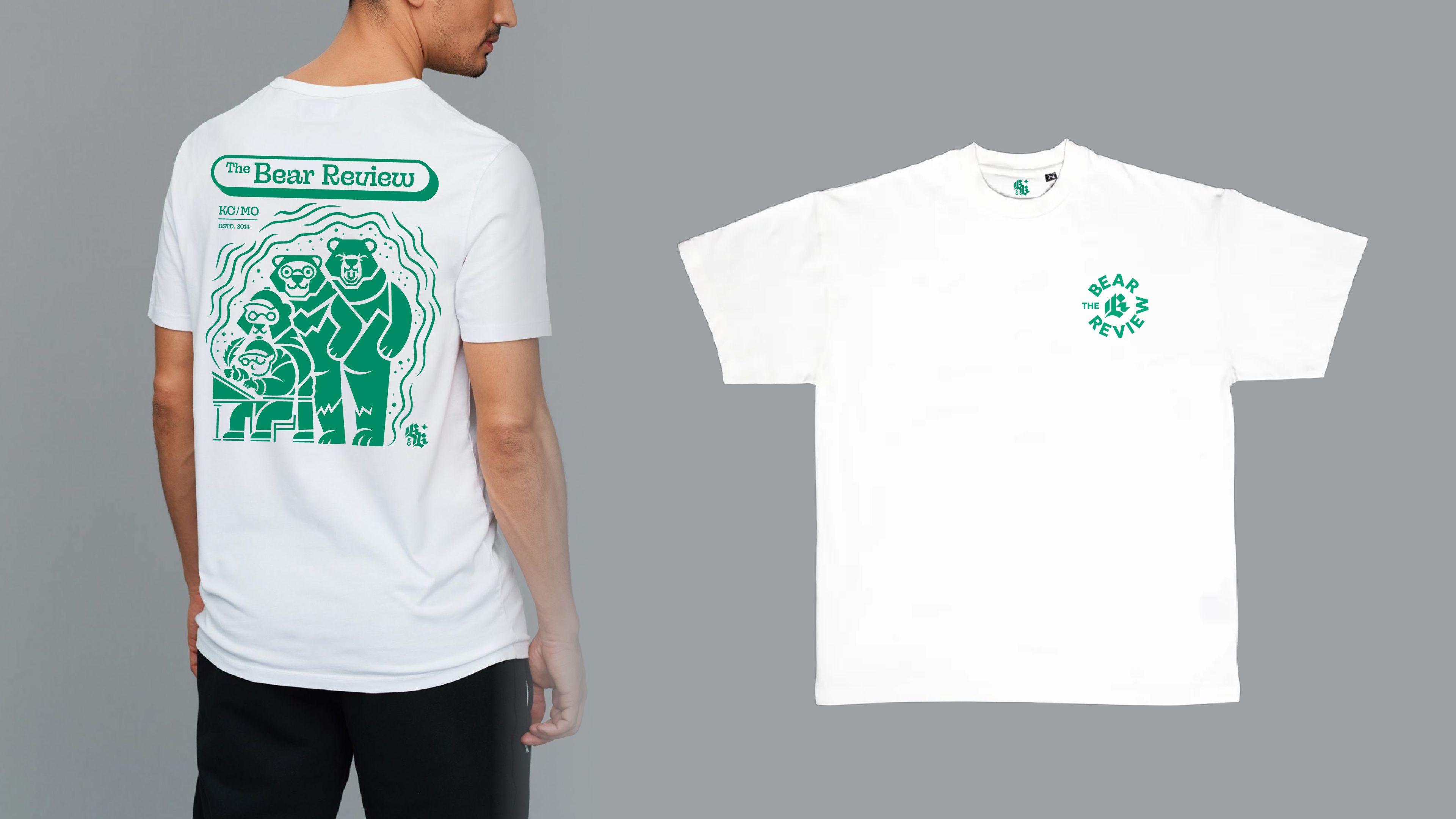
The brand needed to present itself across web, social media,
and apparel applications.
Solution
For the art direction, the review relies on collage in many aspects of the work it presents.
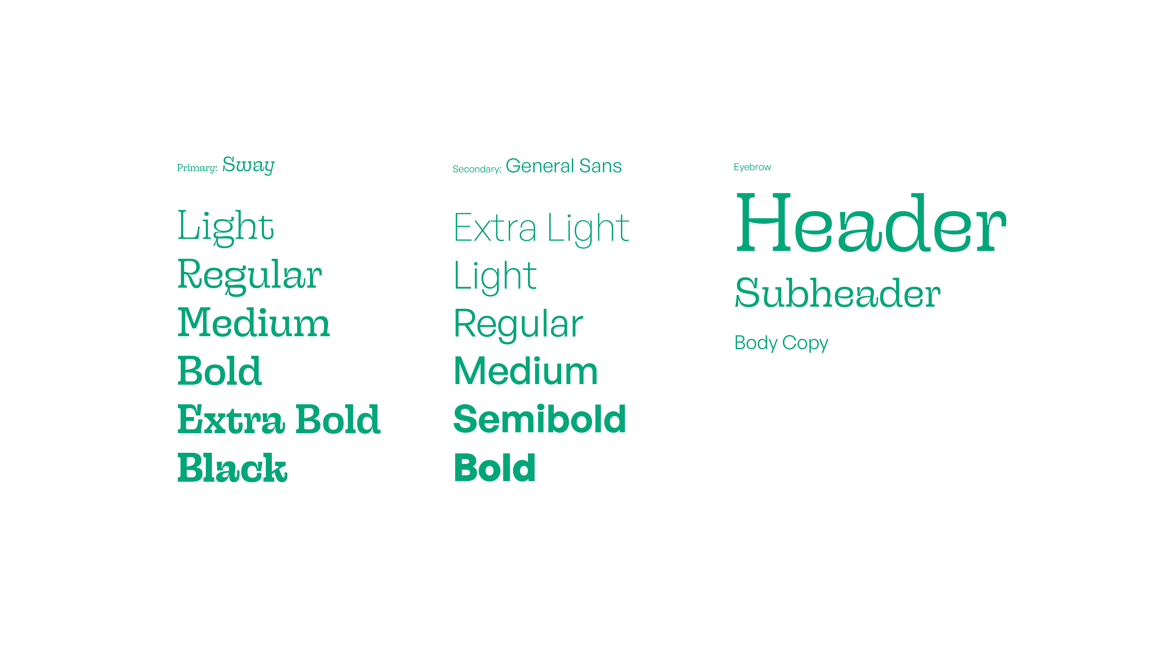
An expressive serif takes center stage as the wordmark for the brand. Underlined by a geometric sans serif, perfect for legible reading of longer poems.
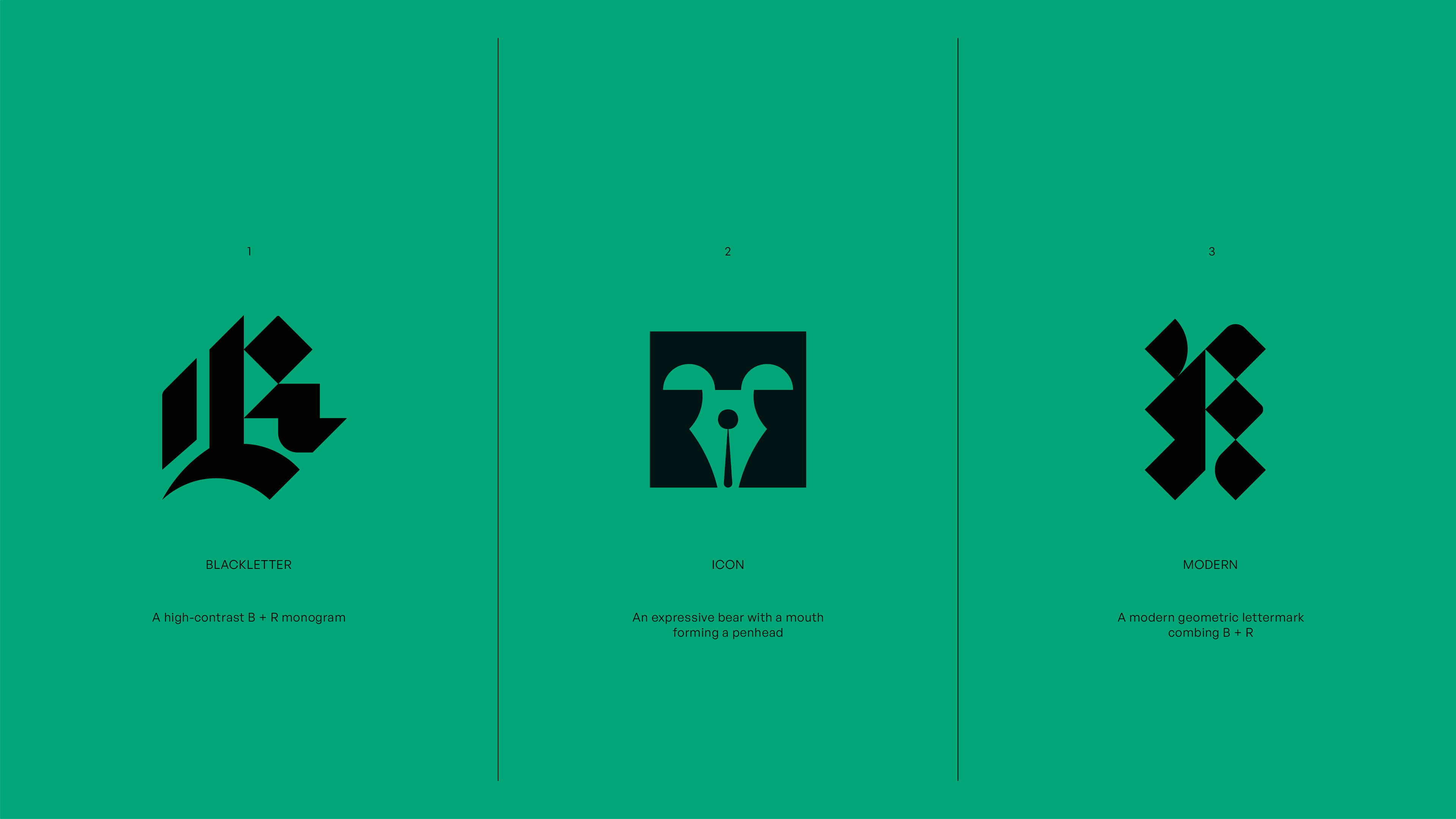
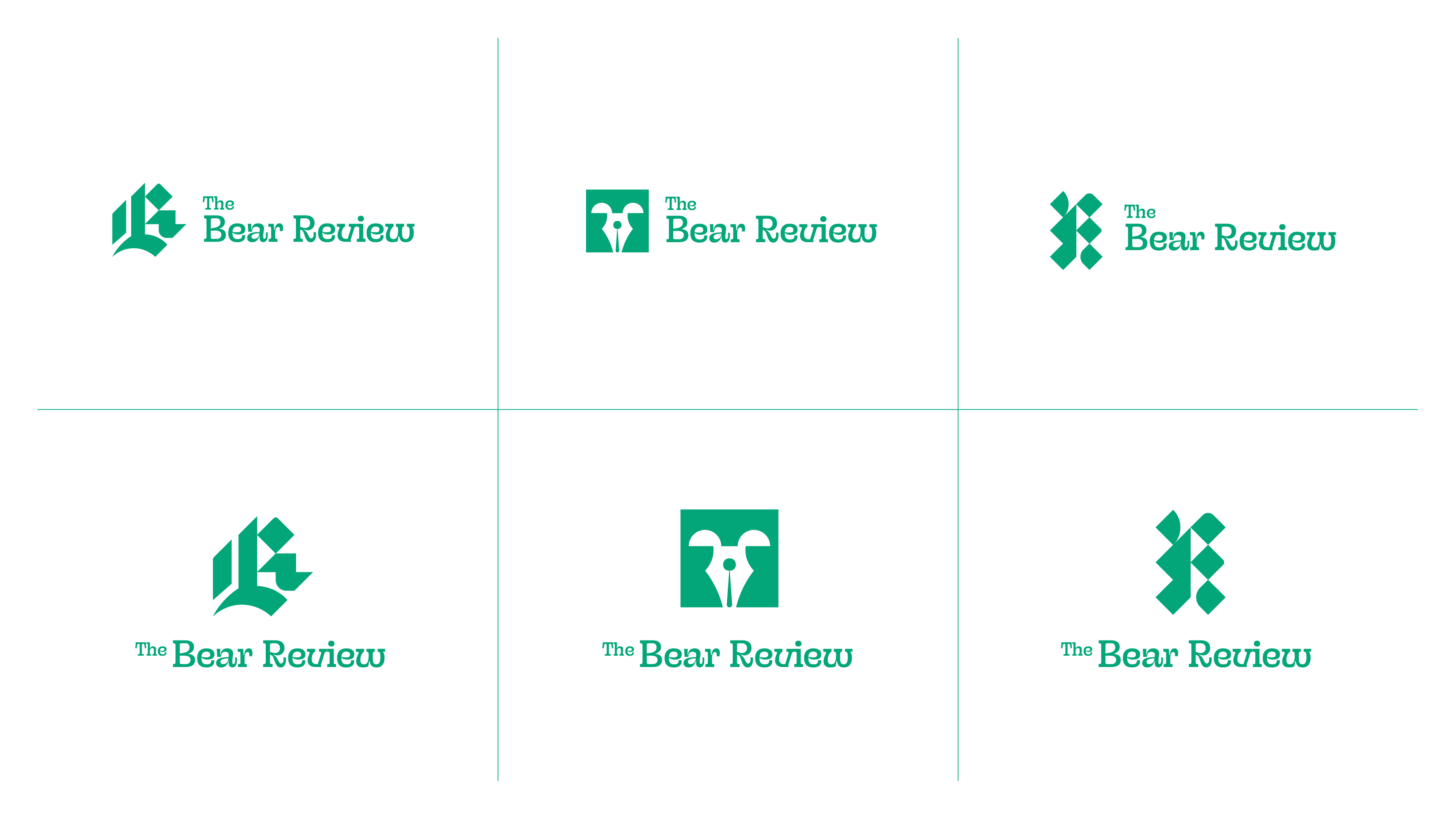
The blackletter B + R logo rounds out the graphic package imbuing the brand with a mark that is timeless and strikingly editorial.
The three styles of type along with a natural color palette to invoke a since of whimsy, curiosity, and professionalism across brand touchpoints.