Kansas City Marathon
Kansas City, MO
Brand ID & Strategy
Opportunity
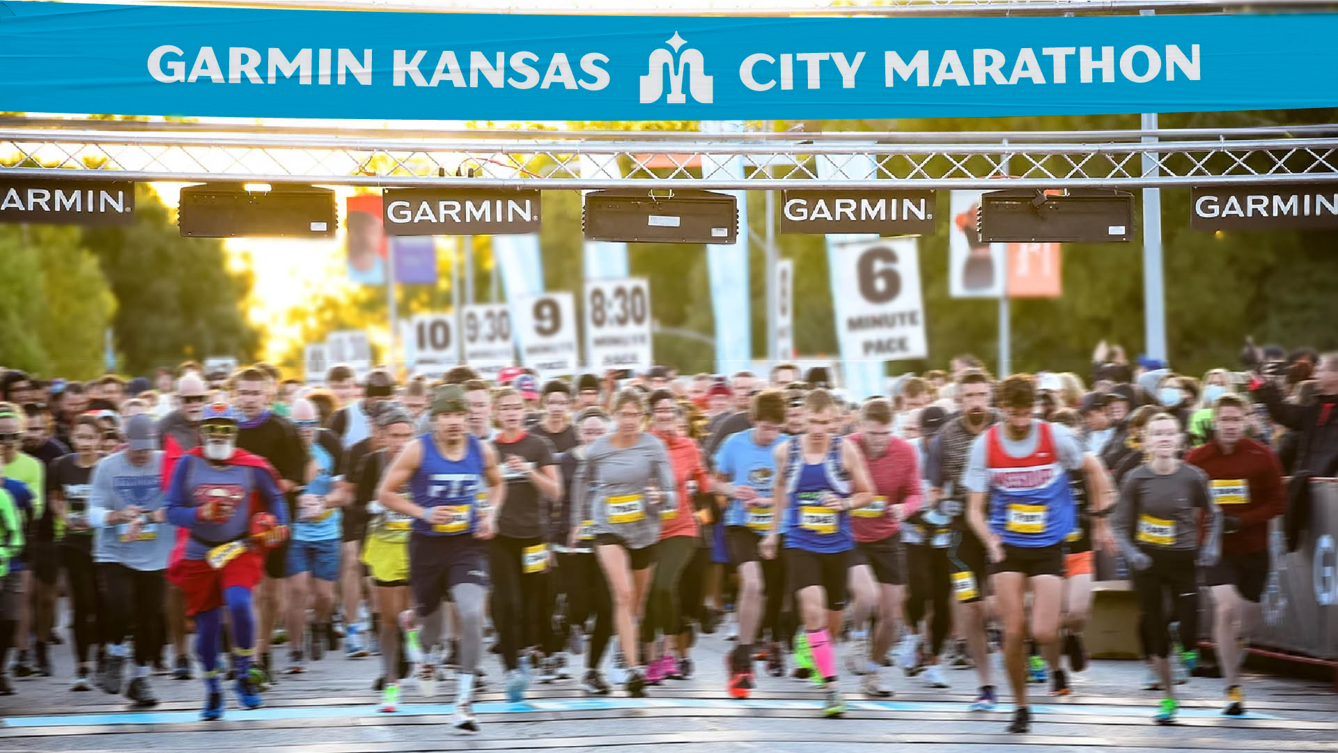
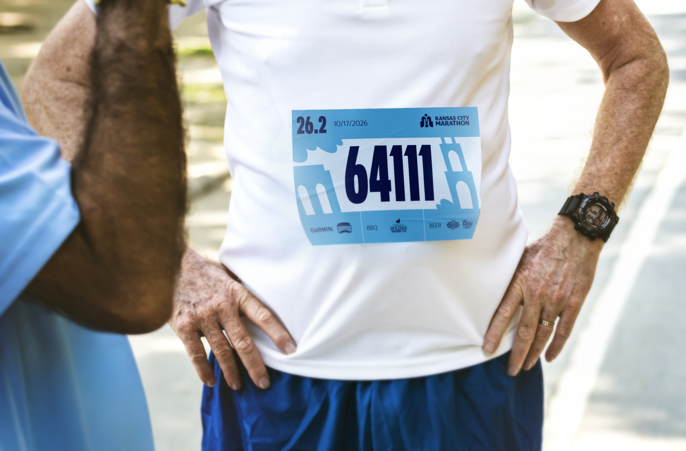
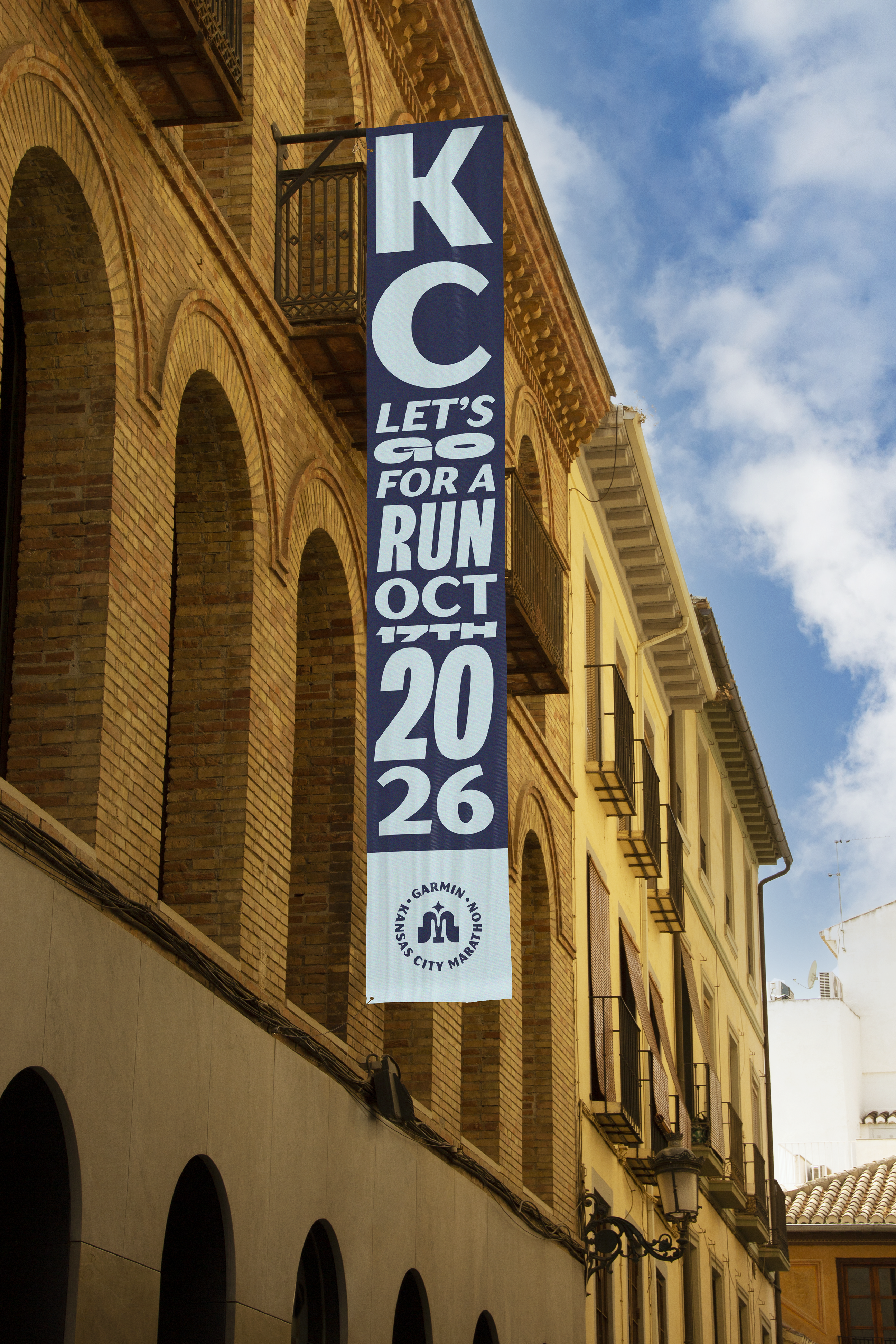
The Kansas City Marathon is an annual set of four races: 5K, 10K, 13.1, and 26.2 held in mid October. Running from 6th to 74th St.
The race itself is Kansas City’s premier road race, included alonside the Des Moines Marathon for runners looking to complete the I-35 challenge.
Based on audience analysis, the current brand has some foundational resonance with it’s runners. There is positive sentiment with the fountain iconography and moniker.
However, after the discovery phase, it’s evident the current brand system does not have enough tools to activate the brand across all touchpoints, take advantage of Garmin’s full tech capabilities, and empower it’s KC identity.
Solution
After ideating ~50+ explorations of the brand expression, I approached this brand through the lens of a refresh rather than a transformation.
Assets like the logo and colors both pull from the original brand in some way. Although both were updated to match the refreshed energy of the new brand.
Whereas the addition of new typefaces and layouts provides not only more flexibility but opportunity for audience expression.
The new brand ethos is inspired by the idea of “Chasing your dreams”.
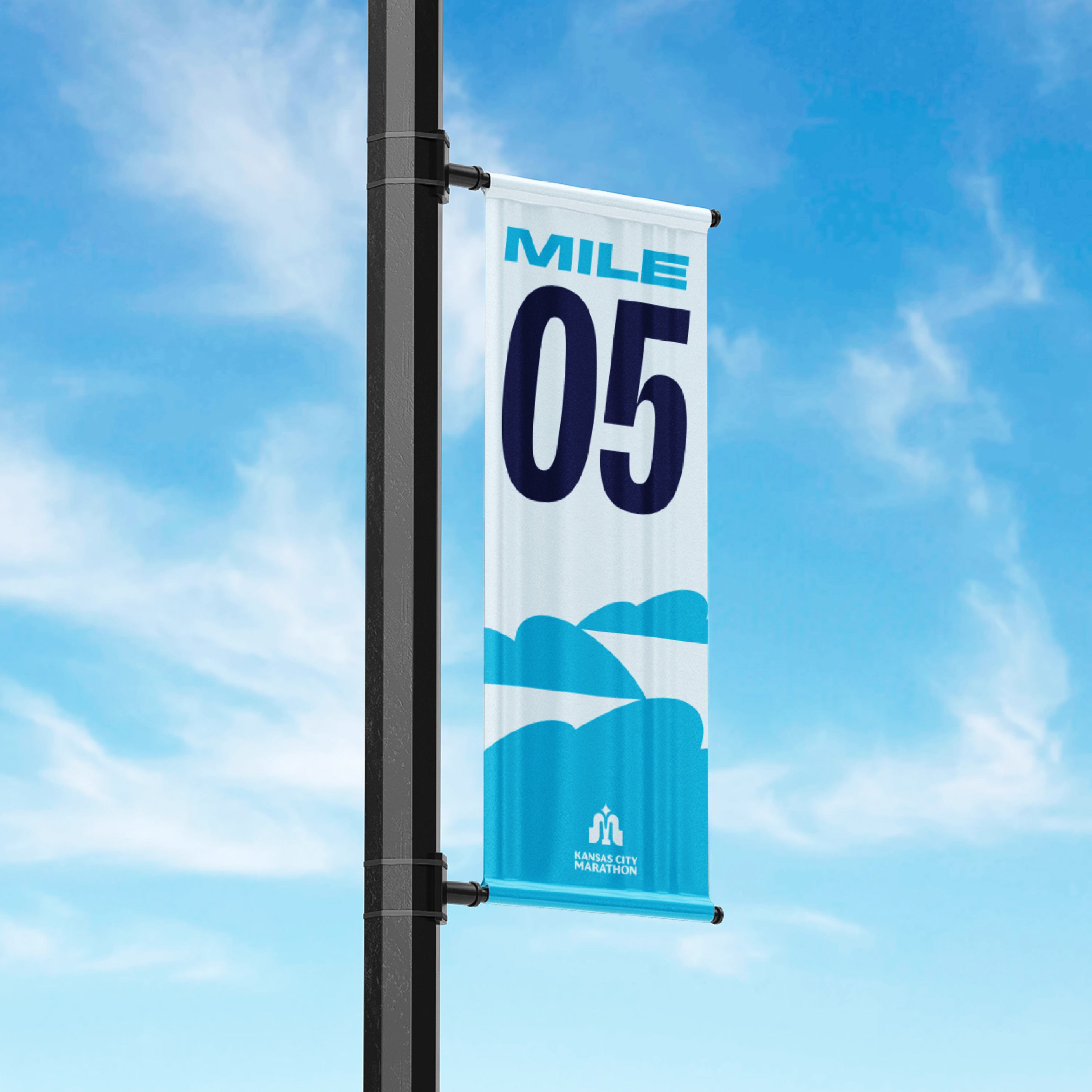
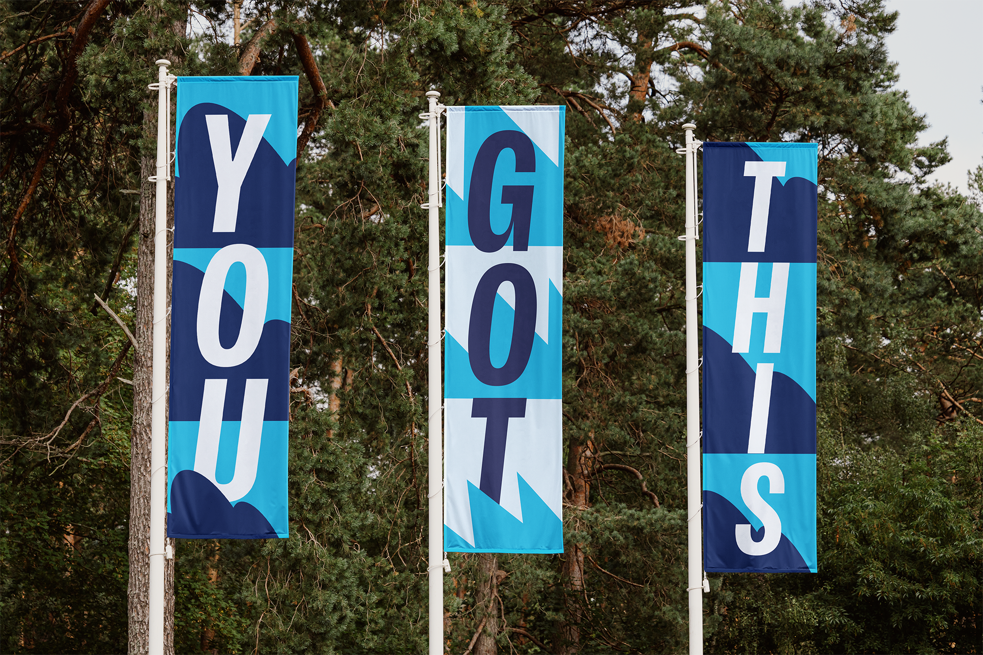
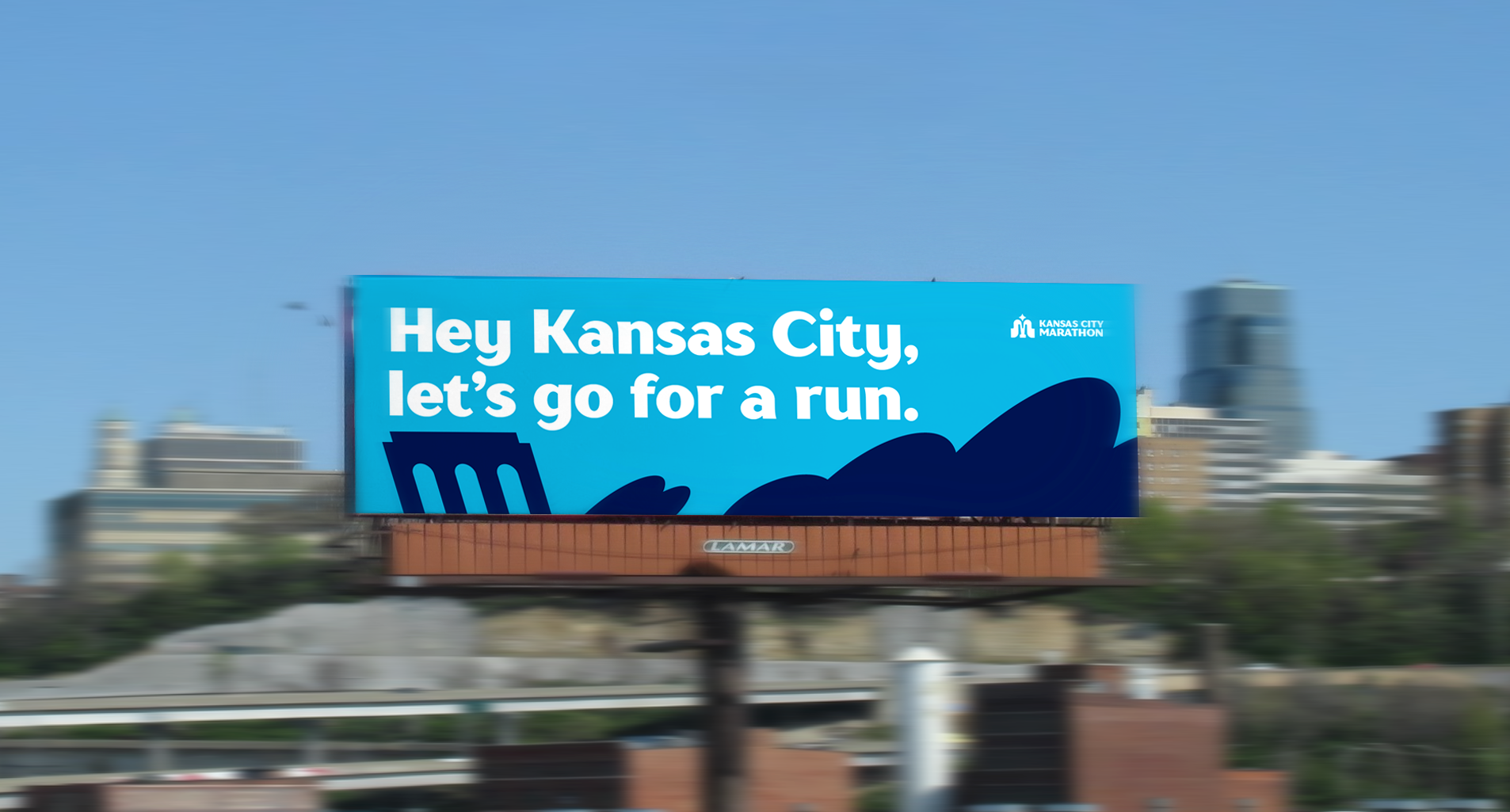
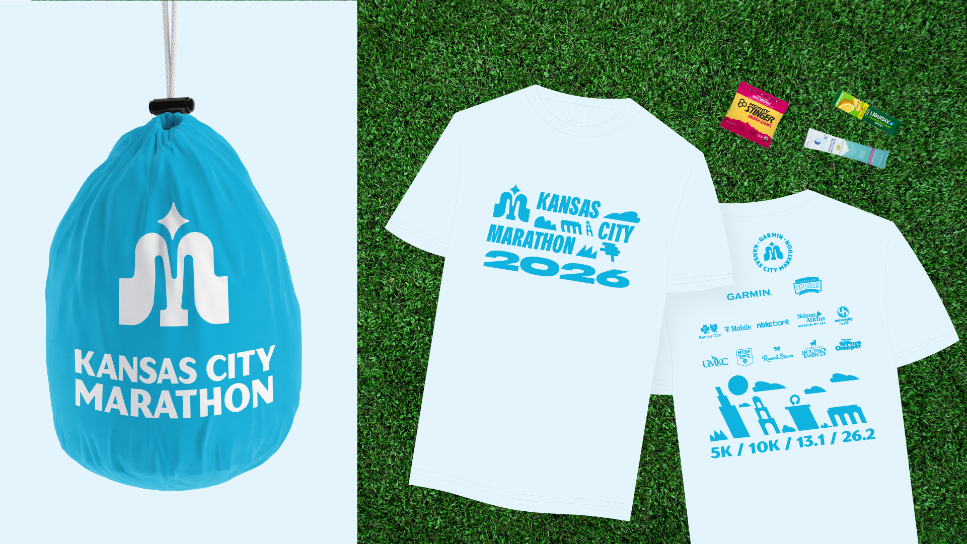
The colors are value-based, logos are bold, and typography is inspired by mural and vintage signage in Kansas City. The illustration system is angled to enable easy expression of movement.
The entire system brings together whimsy and wonder to rally Kansas Citians to chase their dreams.
Results
Overall the addition and consistency of the new brand will boost revenue between 10% and 23% through greater audience recognition and sign up intent.
Ease of use: Easier to pass on to another designer, or even non-designer and keep the brand consistent.
Scalable: Addition of a scalable icon system and flexible typography allows the brand to show the same energy at every size.
Recognition: Improved brand recognition with custom icon system, illustration system, and color palette. Brand identity that differentiates entirely from competitors and non-competitors.
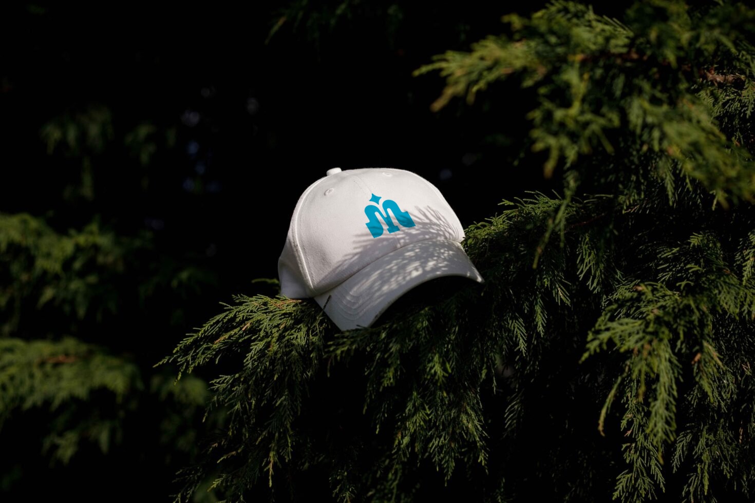
The fountain logo is the central beacon of our brand expression.
The 4-sided star defines the four races offered: 26.2, 13.1, 10K, and 5K.
The M is symmetrical reflecting both sides of the city. Based on audience analysis and public opinion the “City of Fountains” iconography resonated strongly. Due to this strong bond, the icon was designed to be a logical step from the previous, with the opportunity to imbue relevant strategy into the identity.
Built on a 16 X 16 grid. The icon was designed to scale as small as needed (favicon).


The logo pairs with the “Kansas City Marathon” wordmark to create a scalable icon system.
Vertical and Horizontal lock-ups are essential for brand consistency with high variance between touchpoint width, height, and relative size.
The logotype (icon + wordmark) is the primary logo, meant to be used in most brand applications.


TT Drugs will serve as our workhorse typeface for general business communications. Thin, Light, and Regular can be used for body copy, subheads, eyebrows, and breadcrumbs. The Bold and Black can be used in larger applications, billboards, headline copy, signage, etc. It was selected based on antique store signage in downtown Kansas City.
Scale VF allows condensed and extended type applications. Use when only TT Drugs does not suffice in the application. Generally add condensed and extended type styles for better type rhythm.
Brand Applications


The color palette for the brand is an extended selection of the previous brand colors. Our primary colors are our blue shades and secondary colors can be used for supporting items, graphics, and race differentiation.
This palette was made with a focus on color value to enable ease of use for other designers and non-designers for deliverables beyond this document.


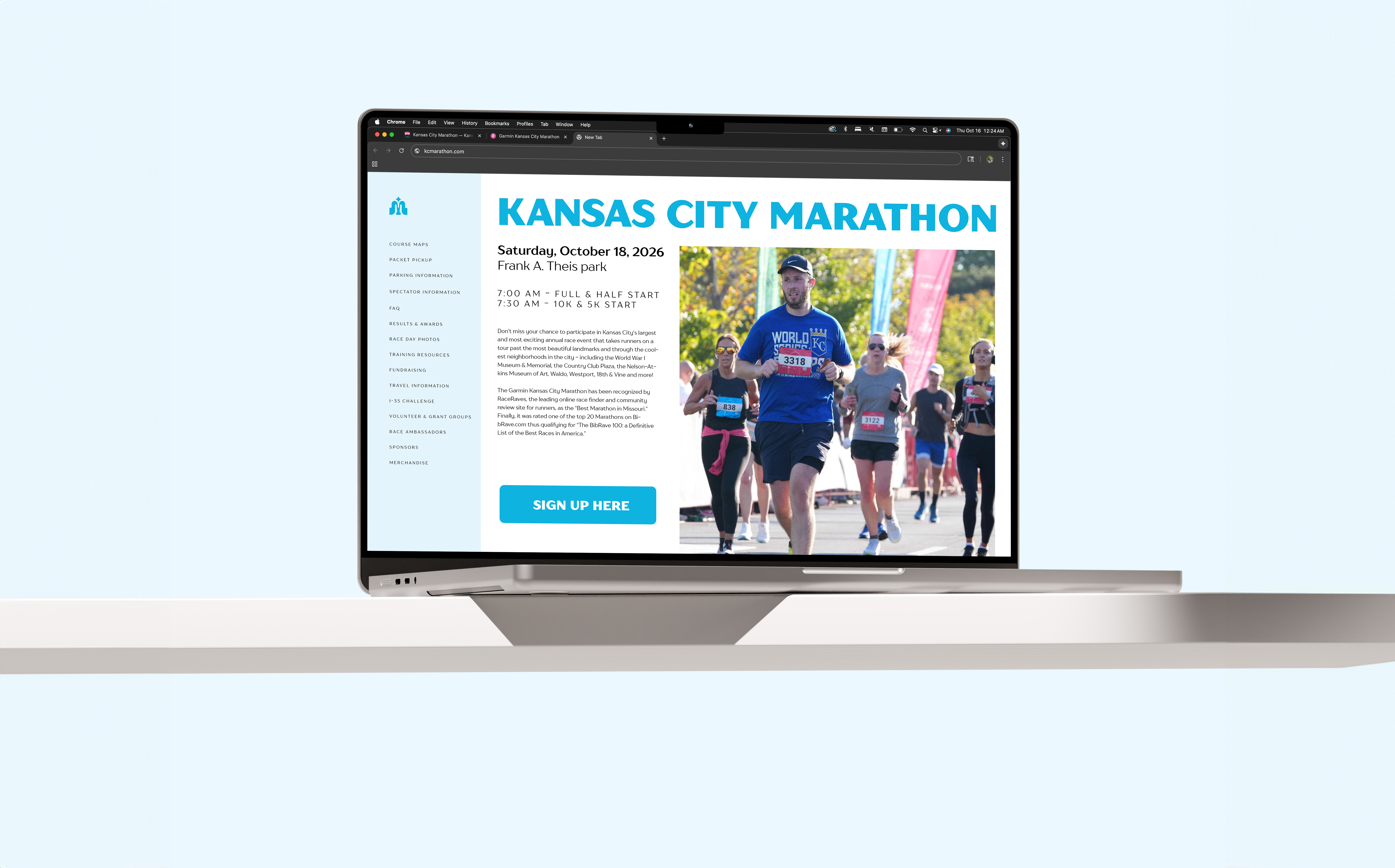


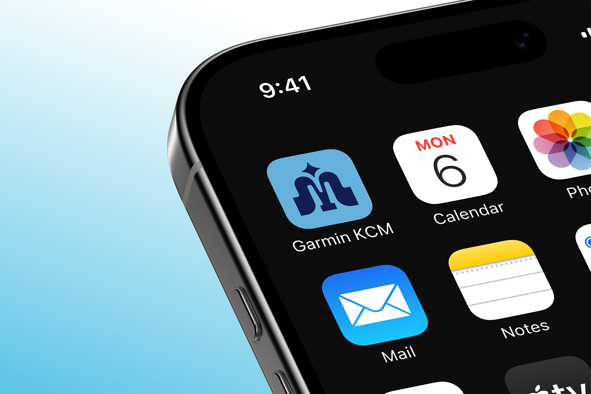
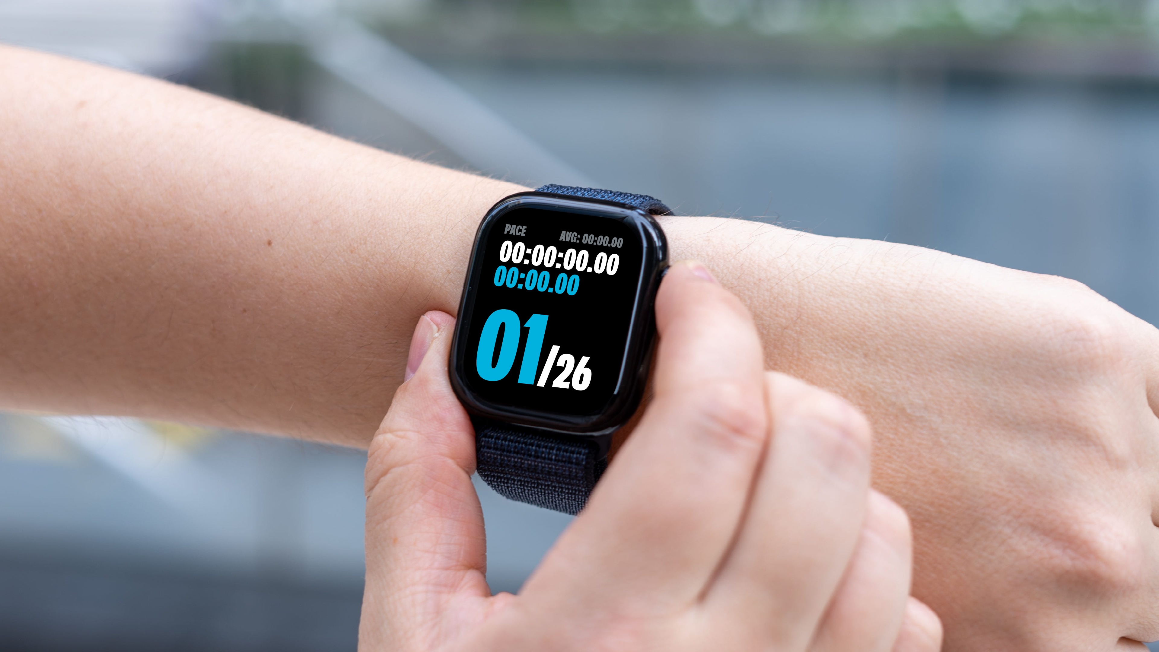
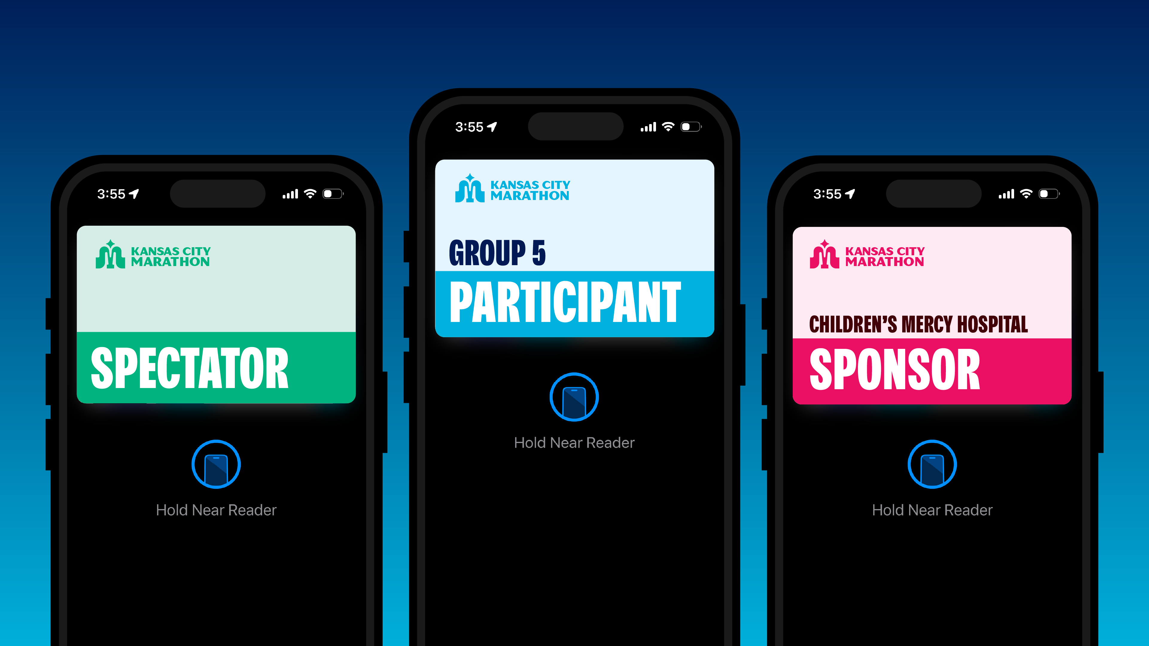
In partnership with the head sponsor, Garmin, the KCM app has been developed to allow easier view of race data, finish line photos, check in badges, and bring racers closer to their race experience.
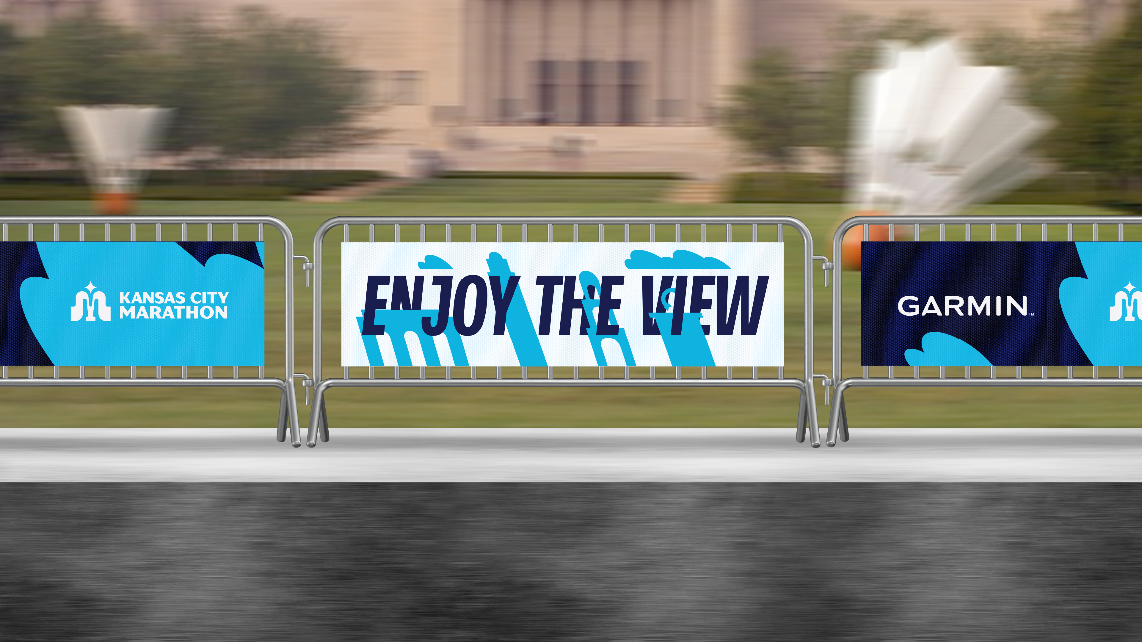
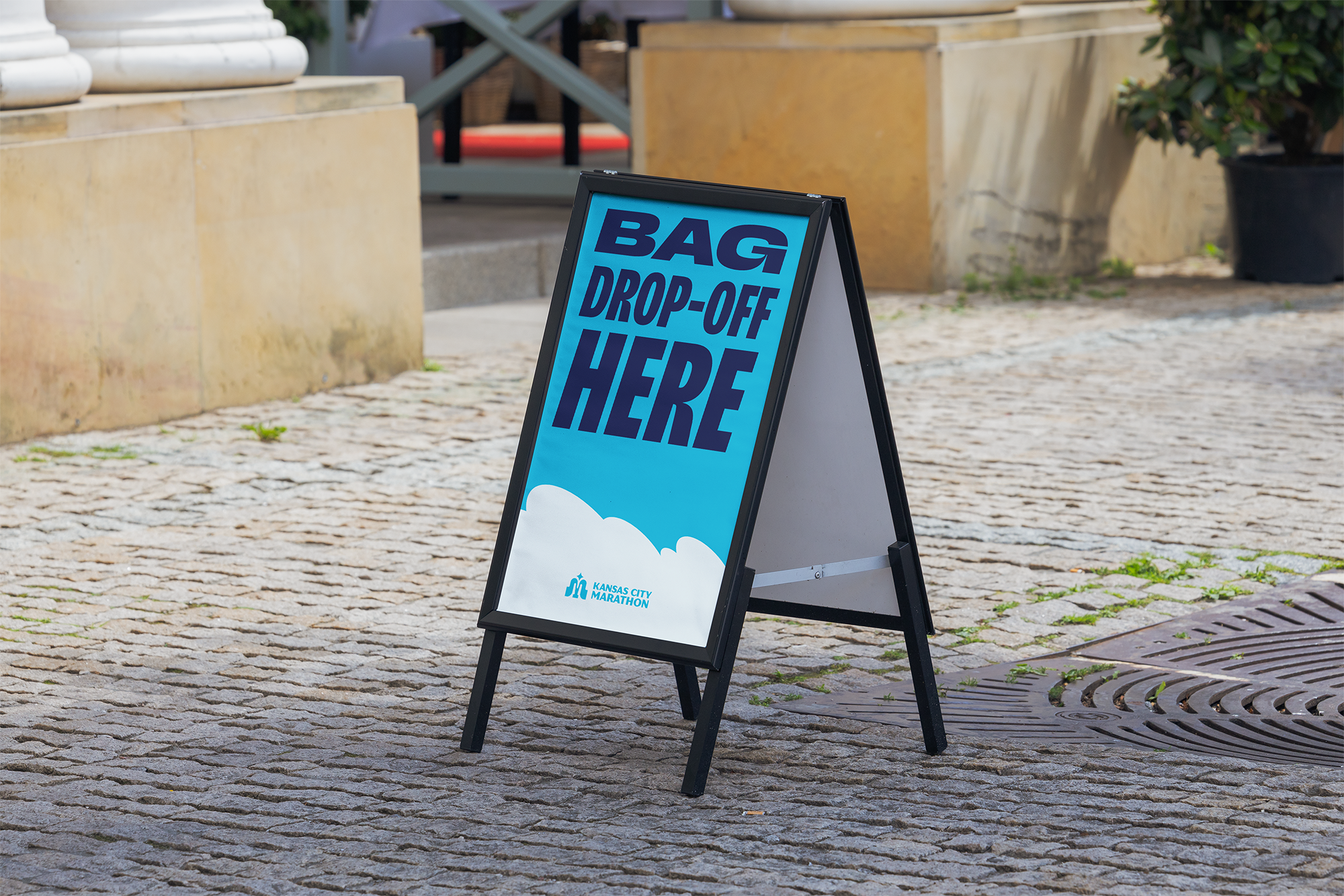
In-Race Collateral