Kansas City Union Supply Co.
Kansas City, KS-MO
[Clothing Brand & Marketing]
Opportunity
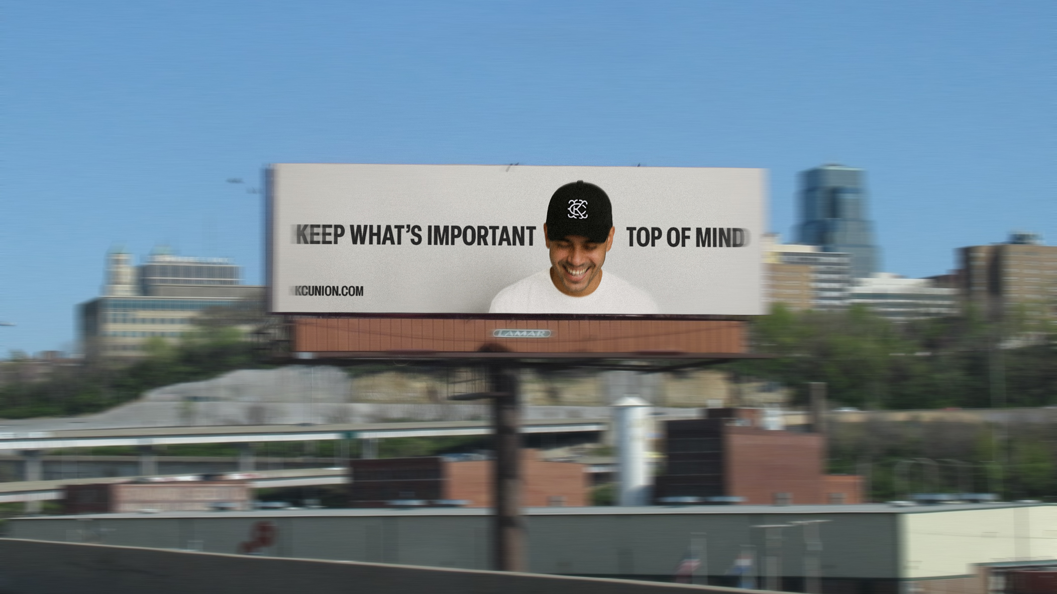
I wanted a new Kansas City hat for non-sport occasions.
Kansas City has a rich history of monograms, influenced by its sports teams, government entities, and individuals artists.
While these designs each hold their significance, I felt there was an opportunity to create a monogram that embodies something else about Kansas City.
The current landscape lacks an identity that reflects the city itself.
Solution
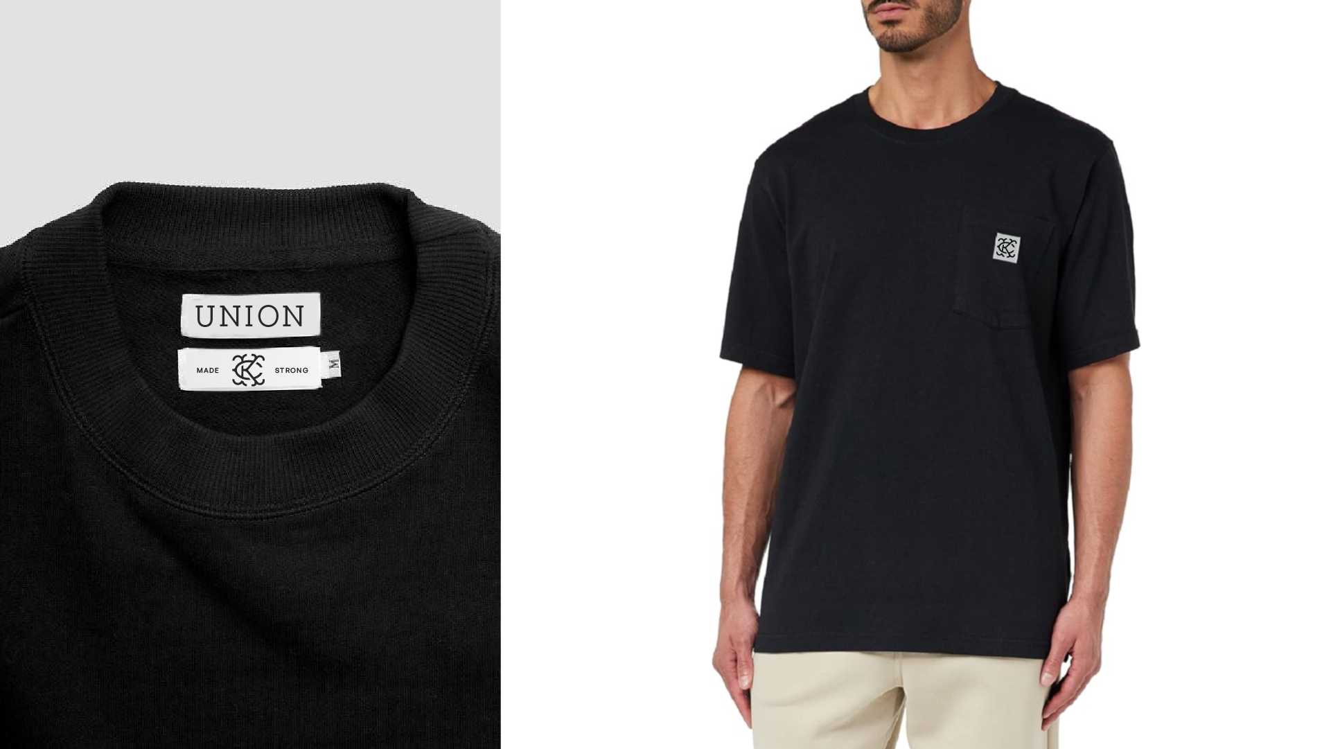
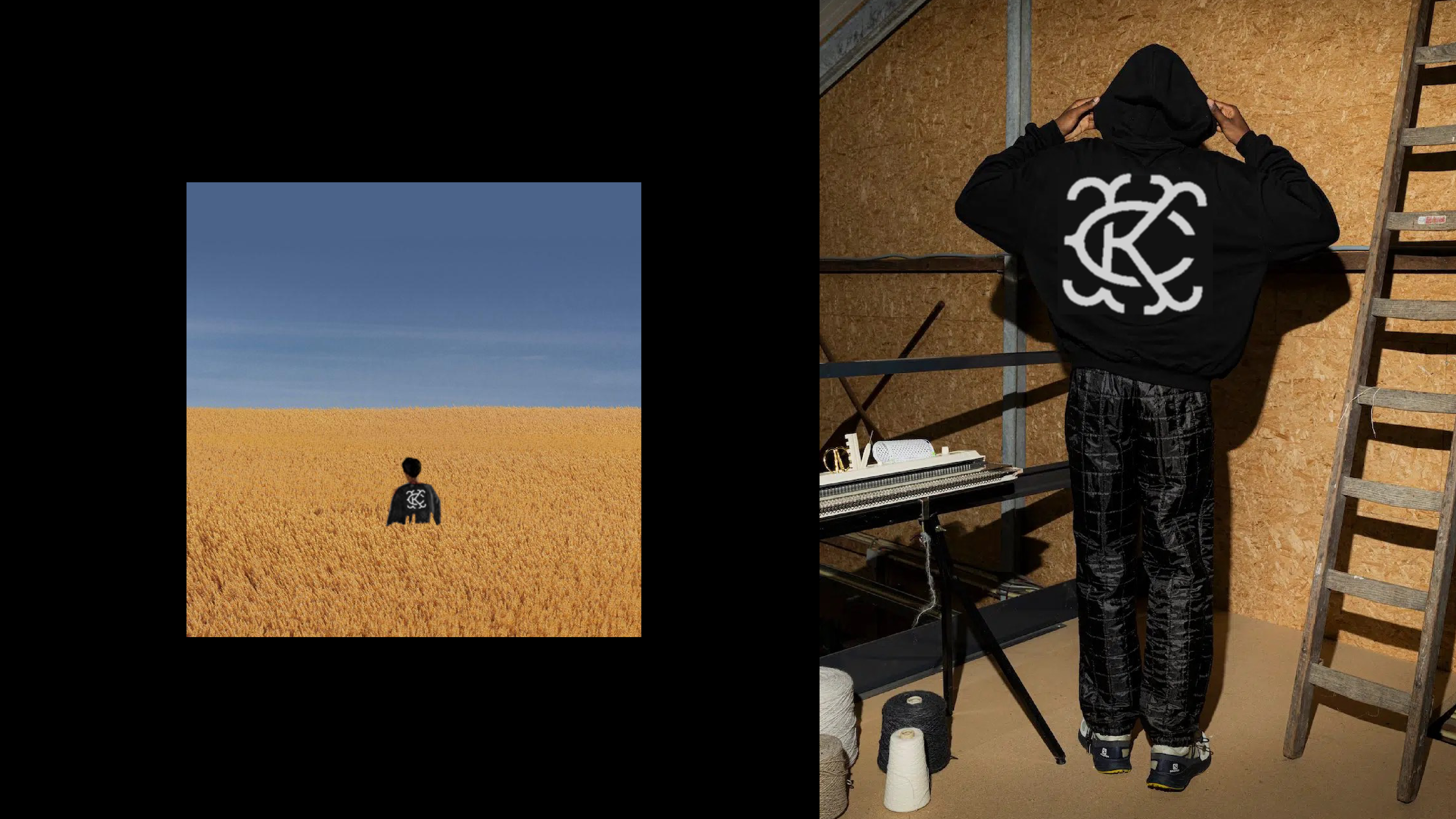
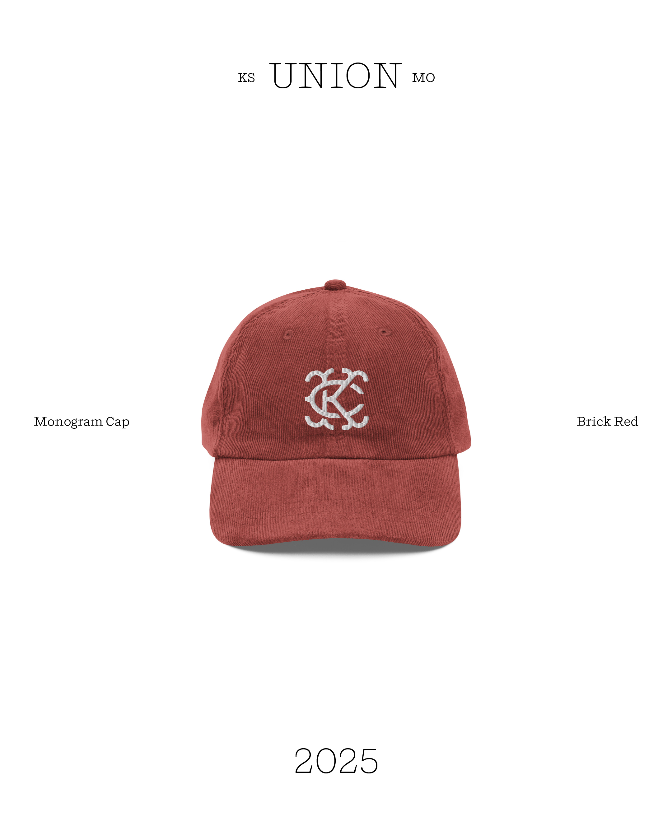
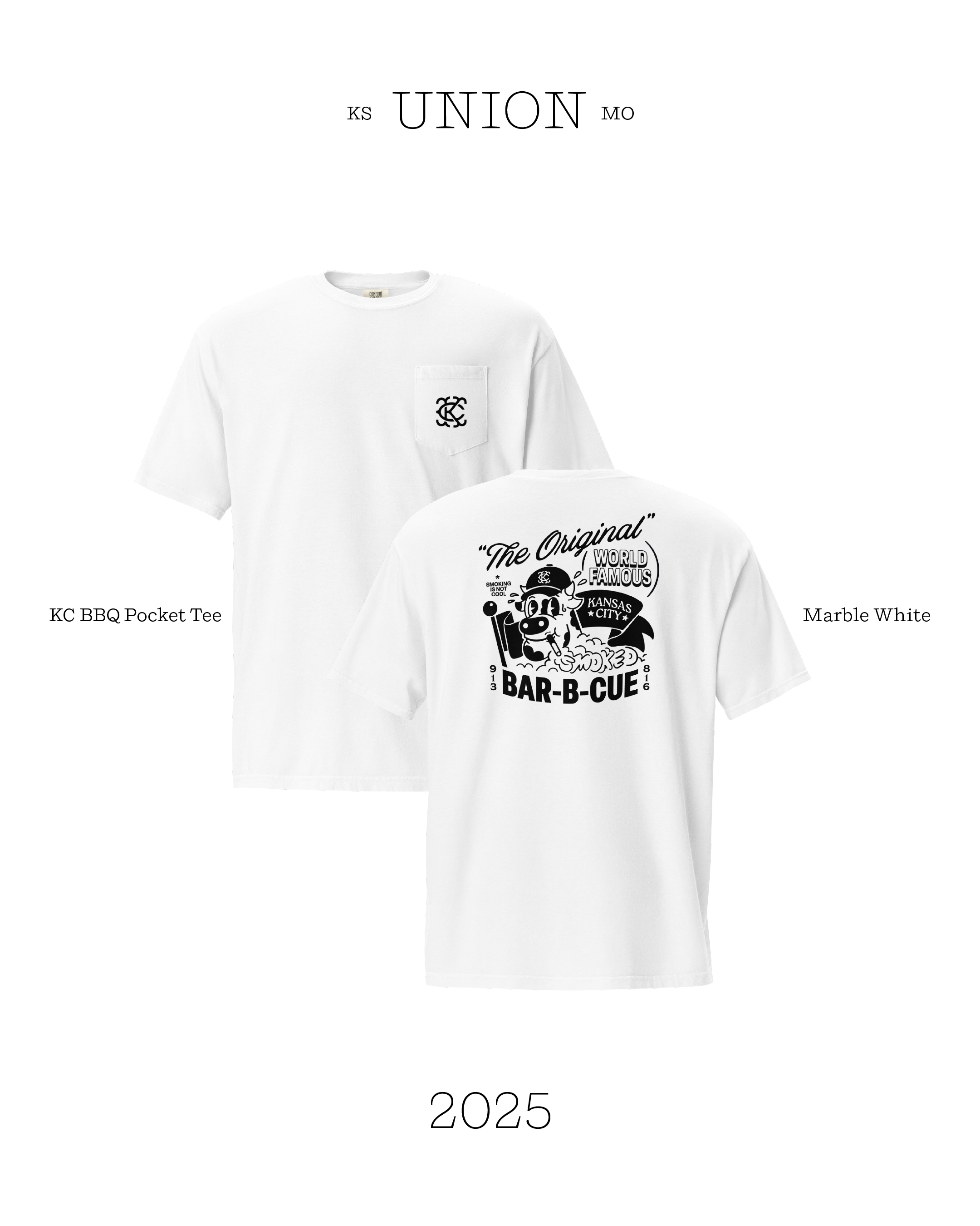
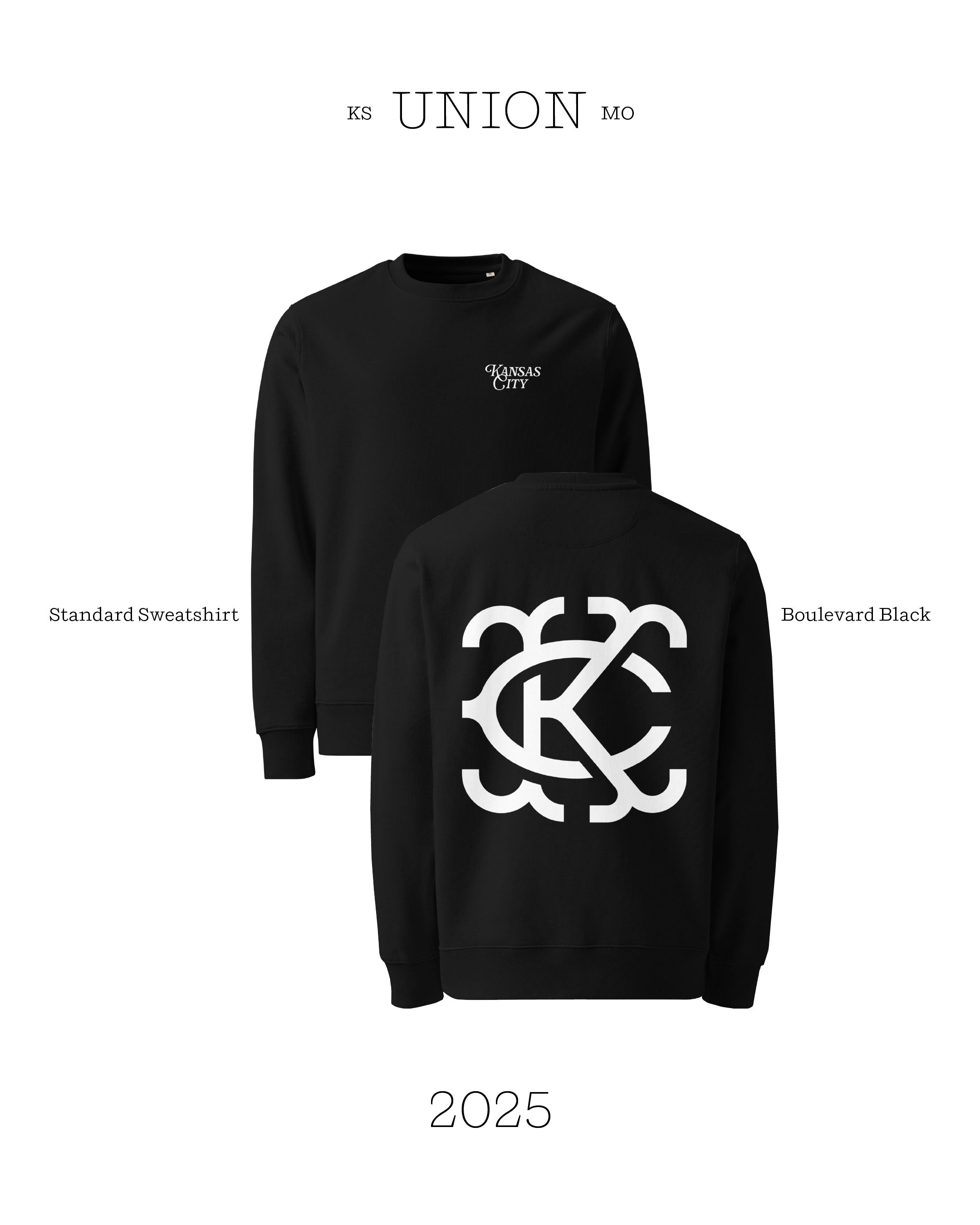
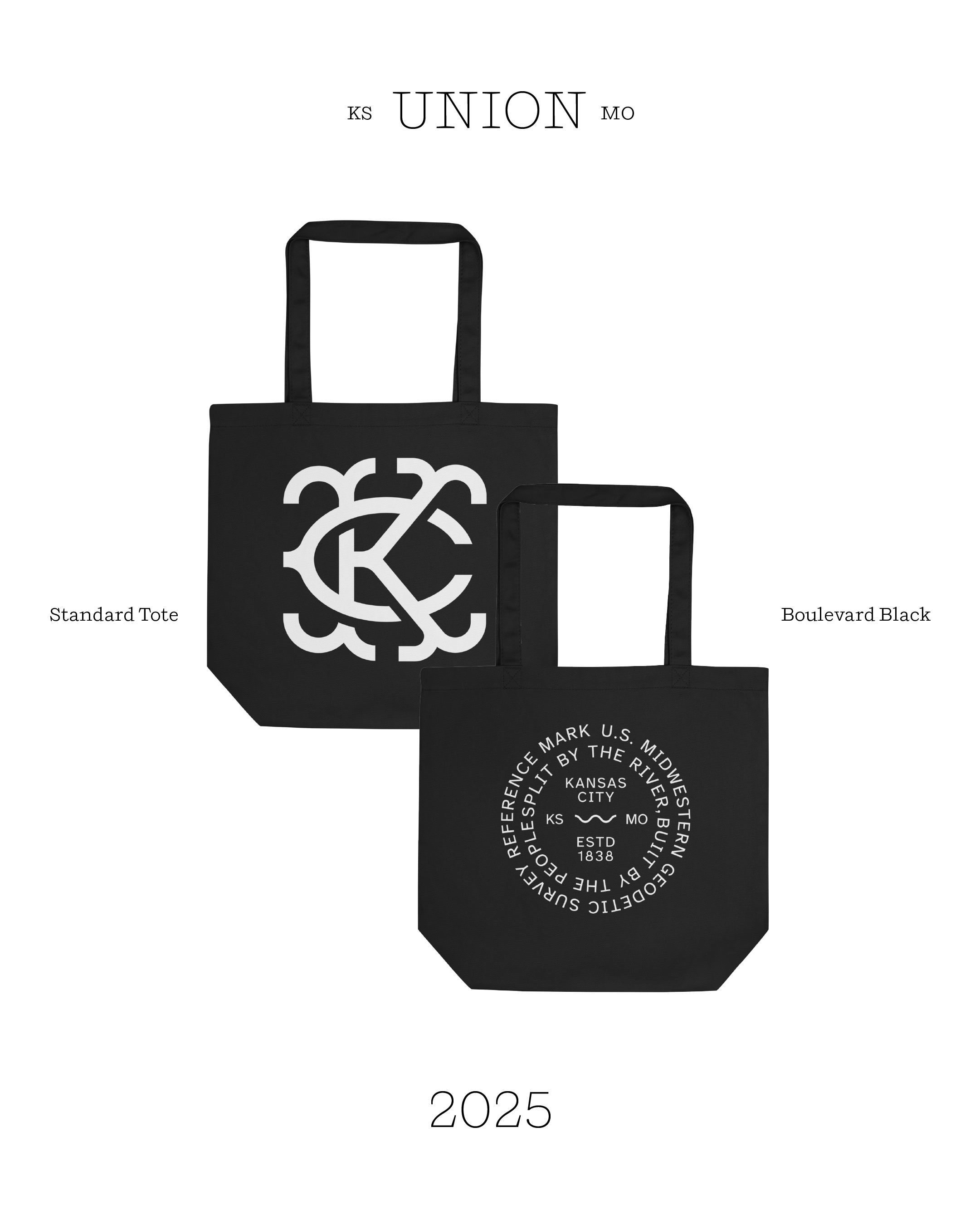
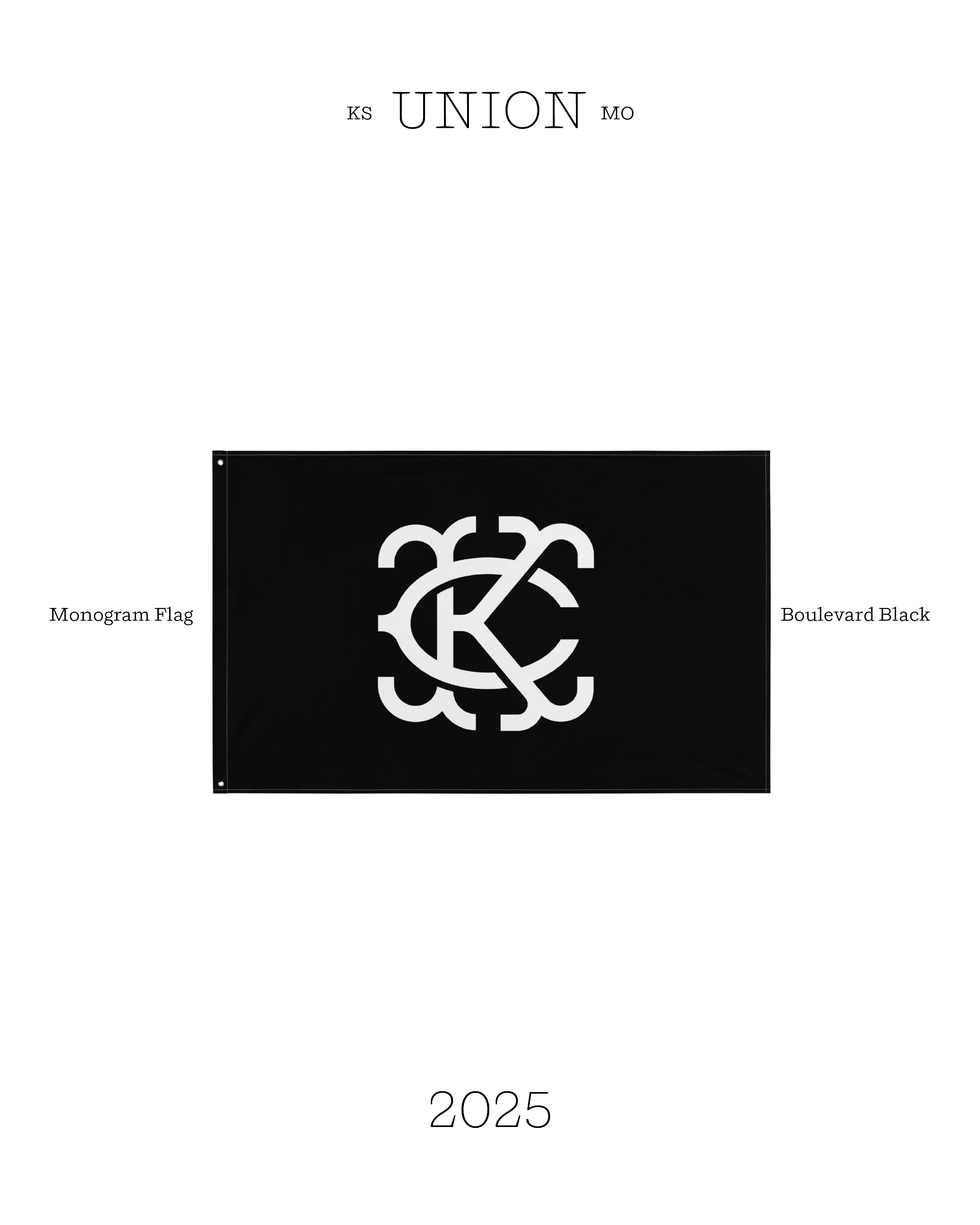
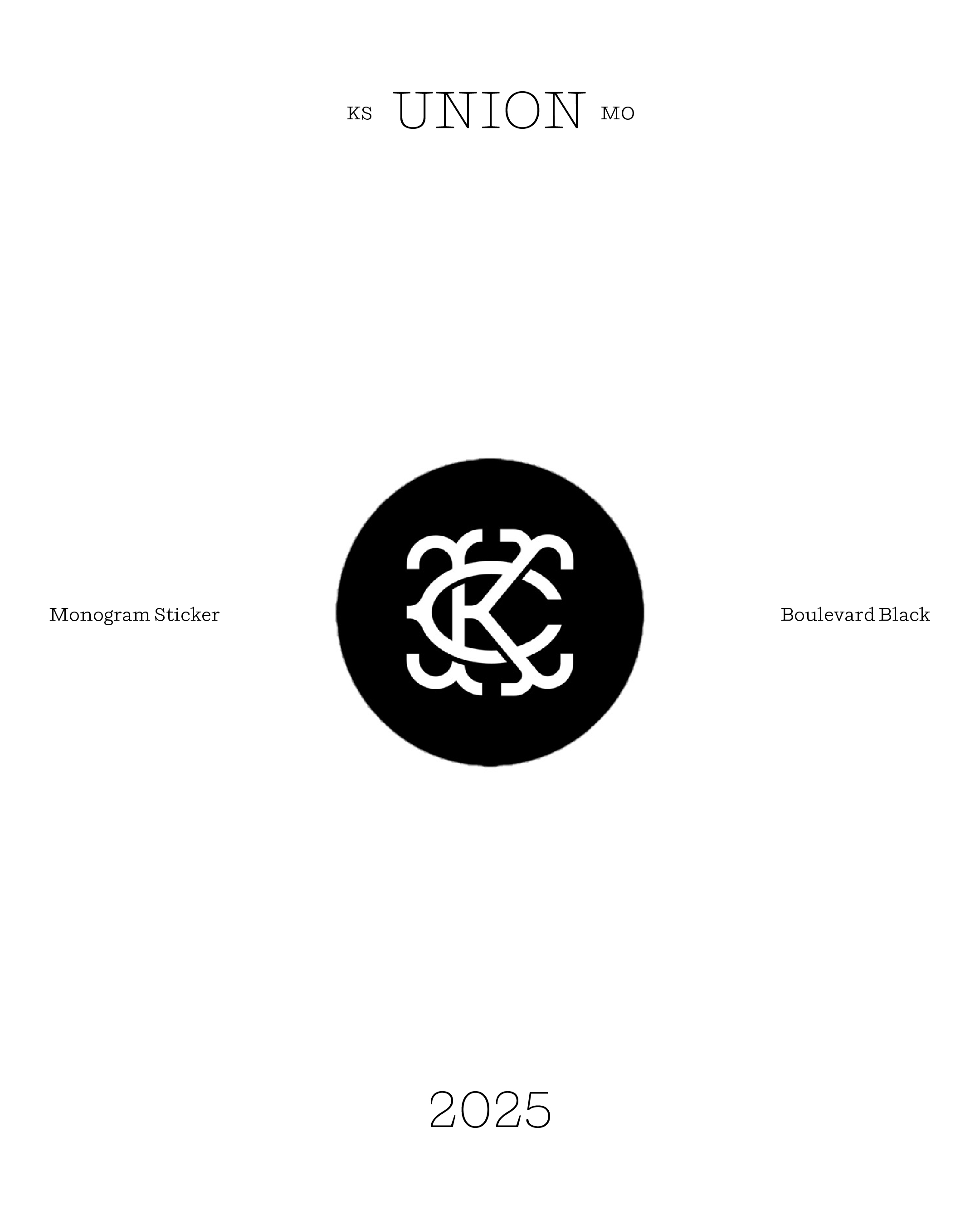
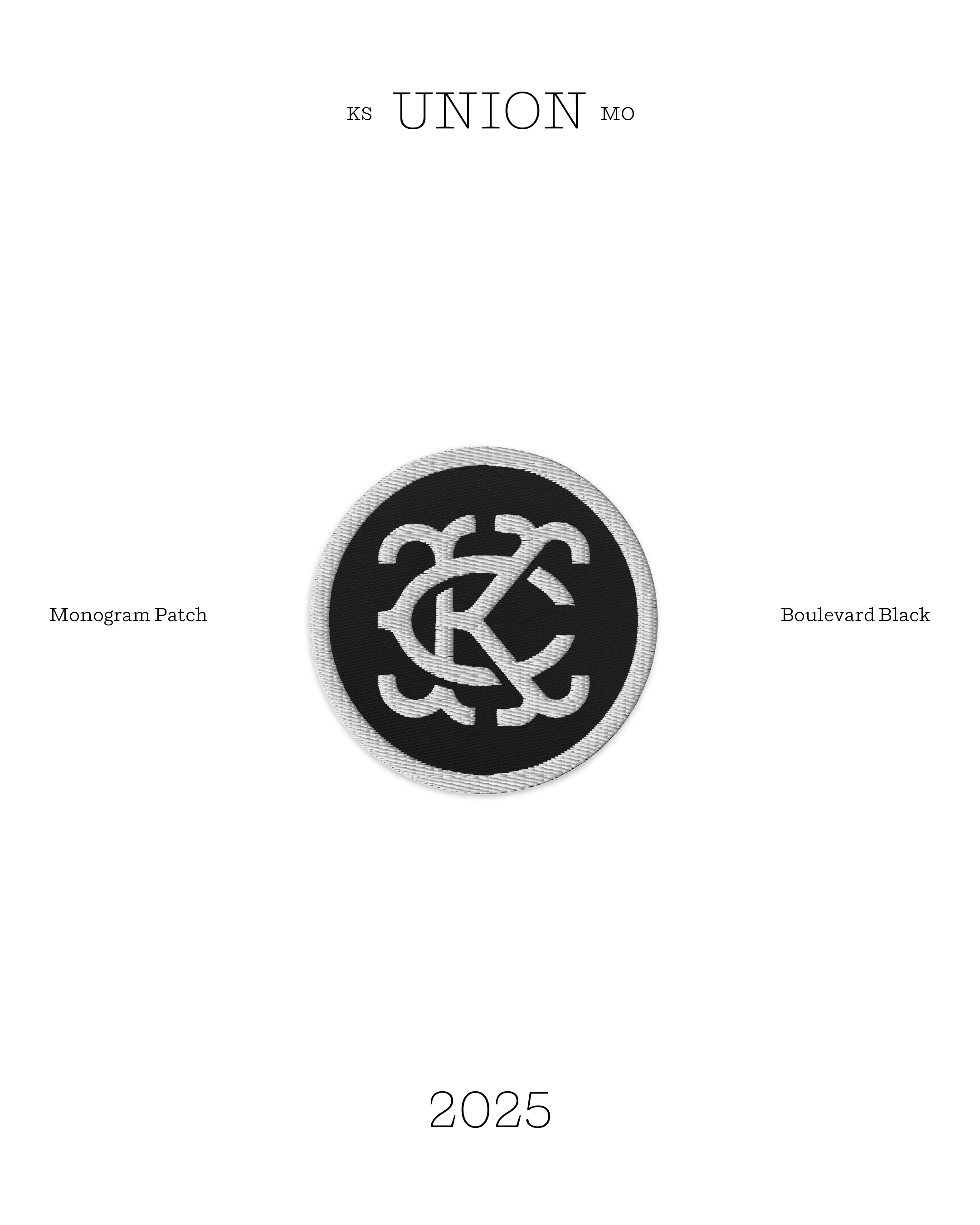
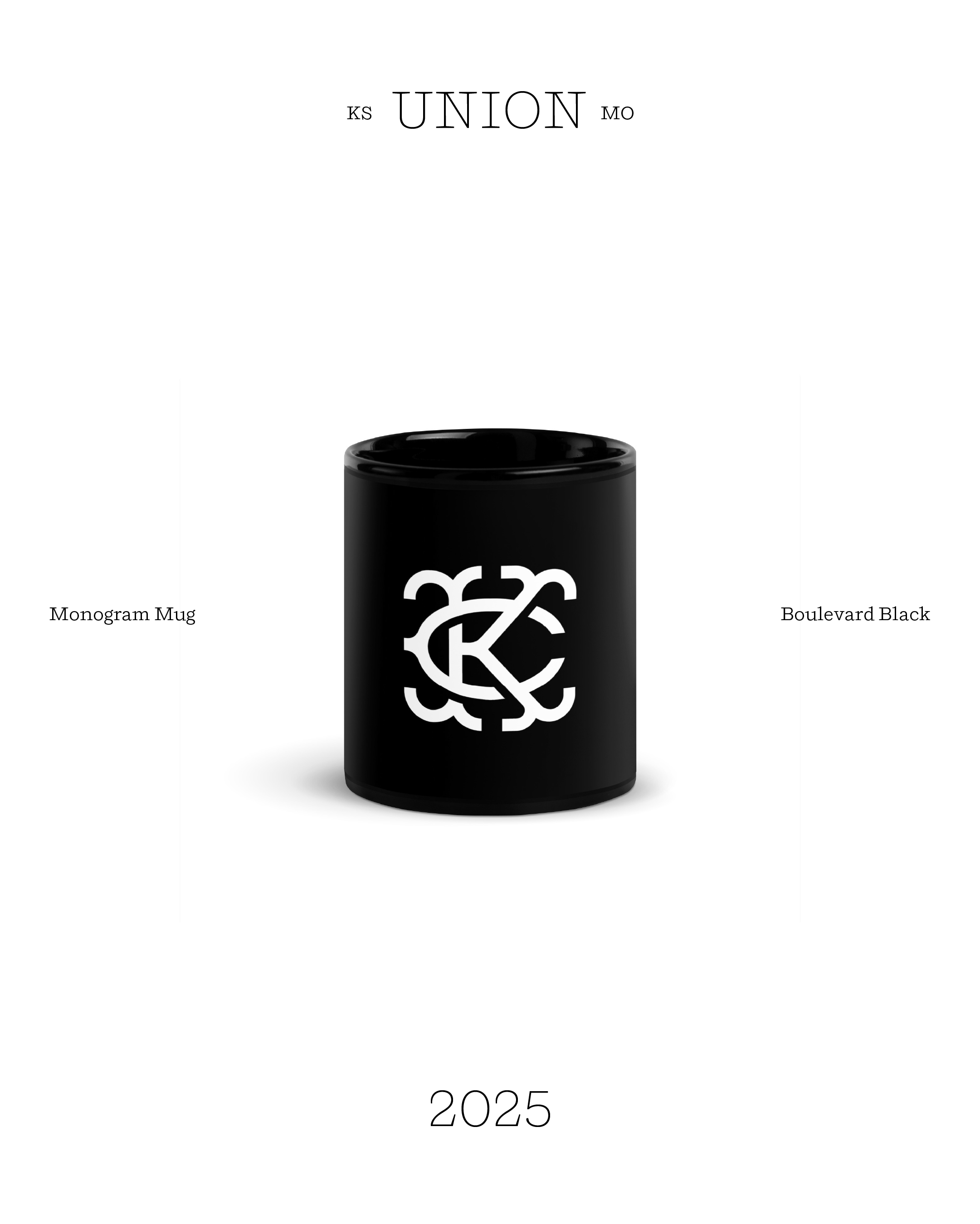
The monogram is a blend of geometric art deco strokes and fish-tail characters. Inspired by baseball team monograms from the early 1900s.
The geometric strokes of the logotype are drawn to appear flowing and passing over like the pipes, bridges, and boulevards of Kansas City.
The icon is legible and scalable to any size and application. This particular design has the unique ability to be replicated in many styles while still remaining true to it’s original form.
Results
2 new pair of children’s shoes bought with donation policy.
Store open 2 months. 1,000 website visits. 1.28% conversion rate. 21 posts. $100 Ad spend. 10,000 views first month. 6,000 accounts reached. 21 items sold. Gained experience in copywriting, web store design, brand curation, and audience positioning.
Instagram


The initial intent was to just make a hat for myself. It turned out I wanted to do something more...

I sold the hat in three colors, black, blue, and red. After the hat was produced and met my standards, I spent a few hours each day practicing content creation and building a shopify store. I was able to practice skills outside of my comfort zone like copywriting, email marketing, UX, video editing, sound design, and art direction. I couldn’t be more grateful to have learned all these new skills and still be able to donate 2 pairs of shoes to Operation Breakthrough.